Project Overview:
There is a disconnect between an individual and their ability to flexibly control the consumption of energy at their home. Plugging a dryer into an outlet in the bathroom results in a tripped circuit breaker as the individual was unaware of the current energy load on that circuit. A student forgets to turn off the lights, air conditioner unit, and tv as they leave their home then has no ability to shut them off until they get home potentially hours later. A mother of four gets a higher than usual energy bill but has no idea what caused it or how to decrease her family’s costs.
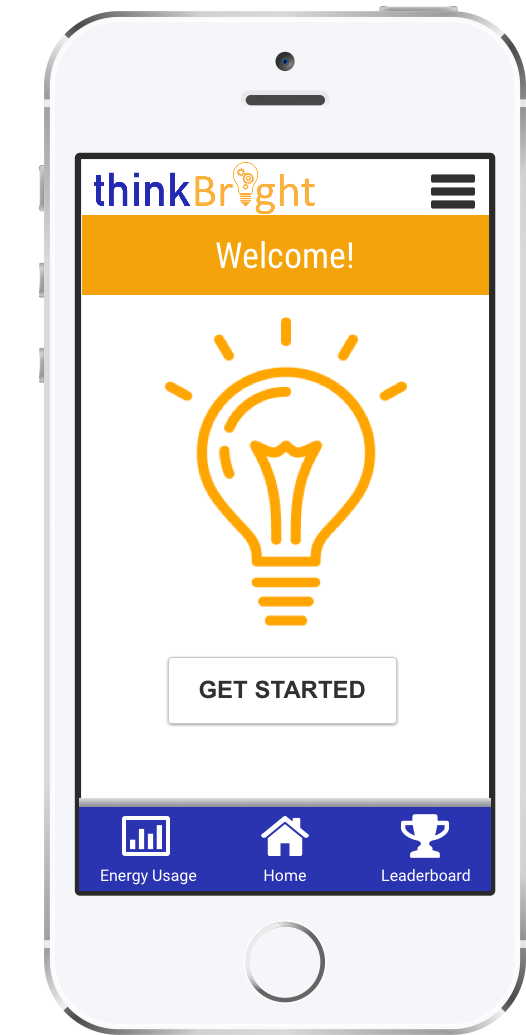
ThinkBright is a mobile application that would be attuned to all energy sources in your home, with the ability to remotely control and monitor the flow of energy around the home, aims to address these issues by giving users the ability to flexibly control their energy usage whether they’re at home or on the go. Currently there are limited options in the US for users looking to decrease their energy use - and none that are easy to set up for non- techy users. With the social drive for finding ways to reduce your carbon footprint, as well as simply saving money, something that allows for heightened control of the complete home energy usage is needed.
Mobile App Components:
ThinkBright’s target audience includes individuals focused on saving money on their monthly energy costs for economic purposes, as well as individuals interested in decreasing their carbon footprint by lowering their energy usage. ThinkBright is designed to be used on the go, whether a user is at home in their kitchen and wants to shut off their bedroom lights upstairs or on their way to work and forgot to turn off their stove.
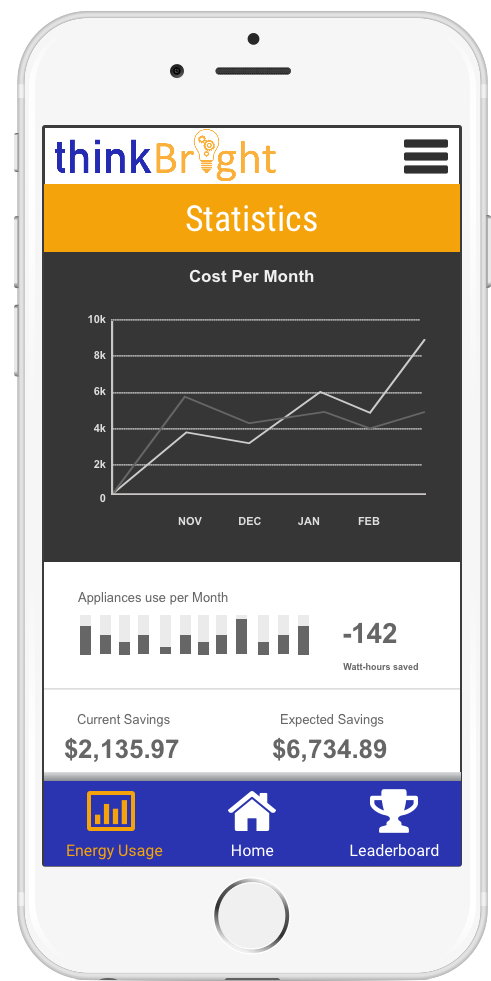
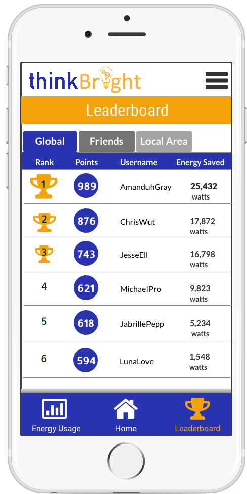
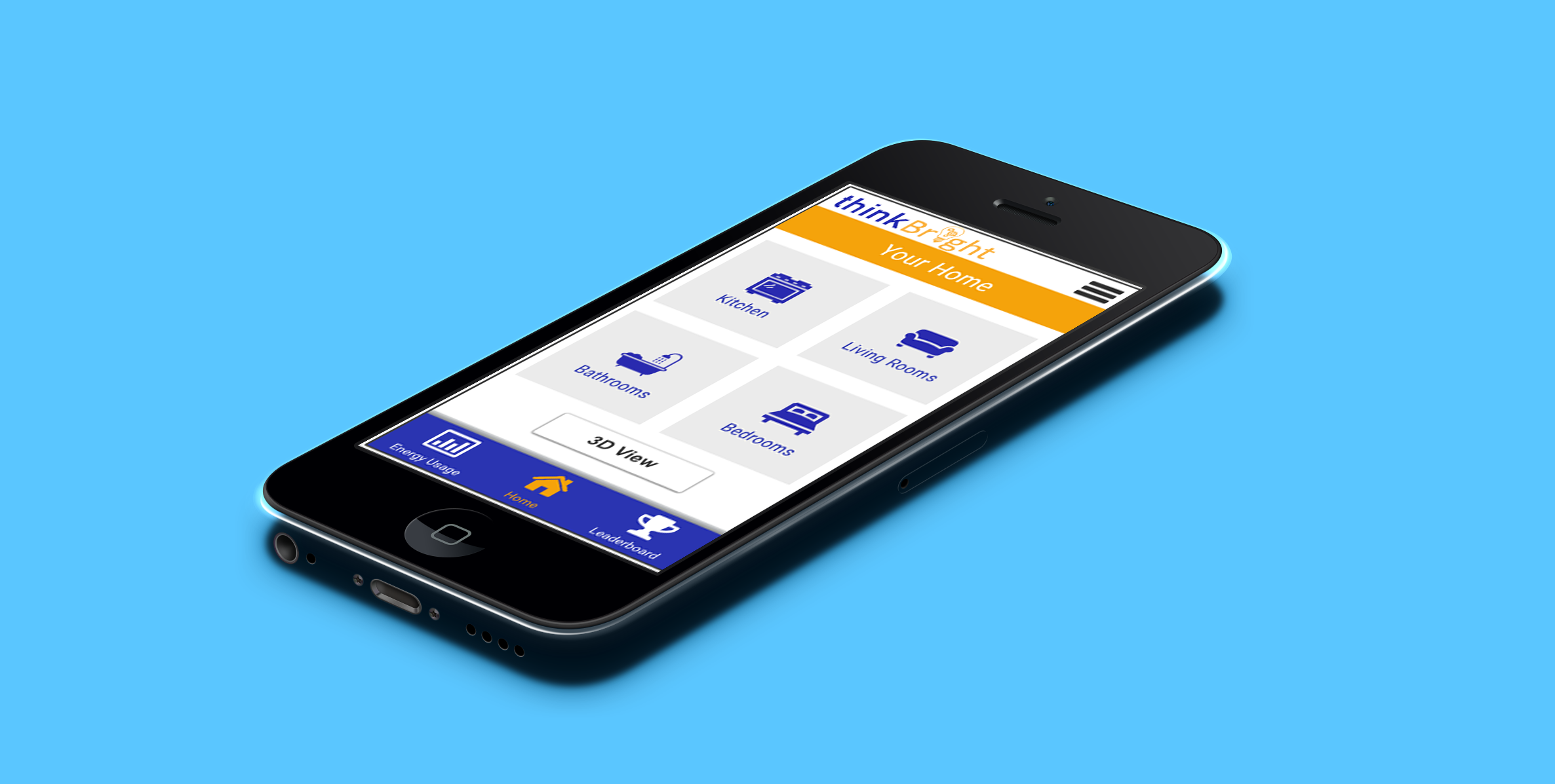
The three main features of the application will revolve around (1) the display of a user’s home energy uses for switching appliances or lights on and off, (2) a leaderboard for competing against other users in lowering energy usage (3) predictive energy bill with advising functions. Constraints for this project were designing an interface that wasn’t too complicated for an average user to understand. Current competitors in this field include products around manipulating thermostats remotely and physical switches on outlets (like the ones in Europe) which allow electricity to be turned off for outlets not in use. Opportunities in this field include finding a way to reduce energy usage and increase environmental friendly options.
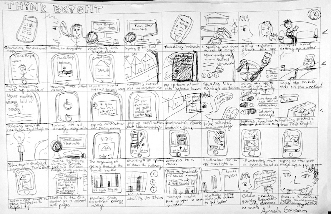
Storyboarding to illustrate user cases for ThinkBright.
Paper Prototype testing:
In our user testing of our paper prototypes, we found that not having a home button option in our drop down menu was a problem. We were met with confusion when we asked users to go from one screen, such as the living room, back to the home screen. We had thought clicking on the ThinkBright logo would be intuitive, however only one of our users attempted clicking on the logo to get back to the home screen. The others clicked on the dropdown menu in order to look for a home option. With this in mind, we added both a home option in the menu, as well as a home shortcut on the bottom nav.
We had also initially assumed that on the home screen it would be helpful to users to see a few statistics broken down on a room by room basis. We found that users did appreciate the overview, but also wanted to be able to go straight to the room from there. We facilitated this in later mockups by allowing access to the specific room from the overview on the homescreen. Aditionally, we added a "more info" button at the bottom of the screen when users click on each room - which brings users directly to that room's screen.
The last issue we discovered in our paper prototype testing was in the room screen once a user’s avatar had entered a specific room in their "house" on the app. The light shining from different appliances and lights versus the exclamation points was confusing to users. They didn't know whether they could click on the lights that appeared to be shining or only the appliances that had exclamation points. We fixed this temporarily by putting exclamation points on every thing that can be clicked on within a room and not illustrating the other lights or appliances as shining. In the future, we’d like to fix this option by graying out the rest of the room while showing the things that can be clicked on in higher saturation.
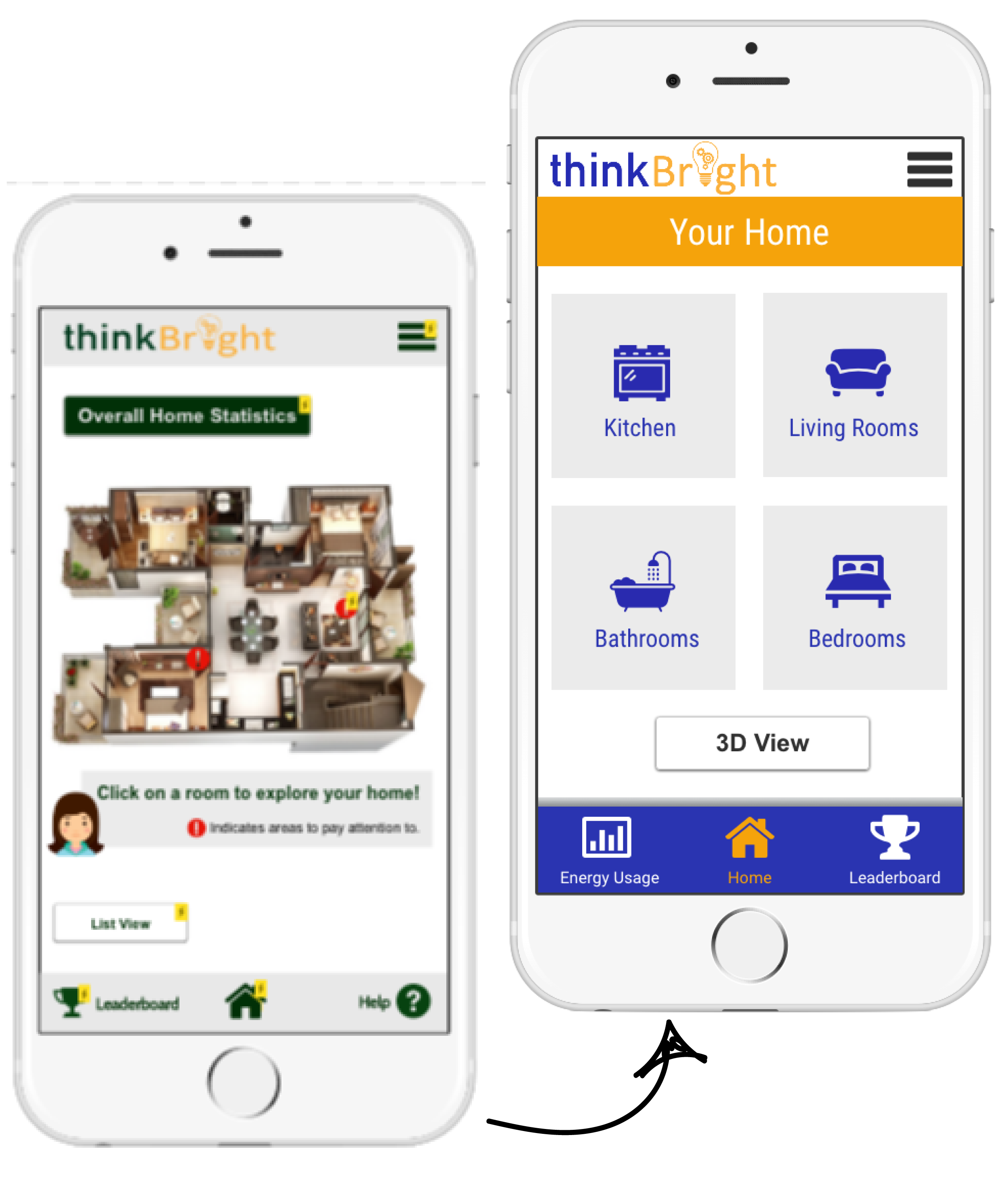
Homepage iteration: default to a list view based on user feedback.
Process:
To build a complete concept of ThinkBright, we first storyboarded overall concepts for our application in multiple settings. This helped gear us toward a design for our target users decided upon with our personas. Our team completed quick sketches to flesh out our ideas further, before illustrating a paper prototype. We facilitated a round of user testing on our first iterations of the paper prototype to discover basic functional issues and confusing user pain points. After tweaking the design based on our findings from the user tests we moved to building a digital prototype - leveraging UX-Pin to create hi-fi mockups.
With our final conceptual idea of our ThinkBright system, a user has the capability to evaluate their home energy usage, remotely manipulate appliances and energy sources to use less, learn about other ways to decrease energy use, compete against other users, and share energy saving progress from both an economic and environmental standpoint. The main user flows showing how these functions interact digitally are detailed in the interaction map at the bottom of this page.
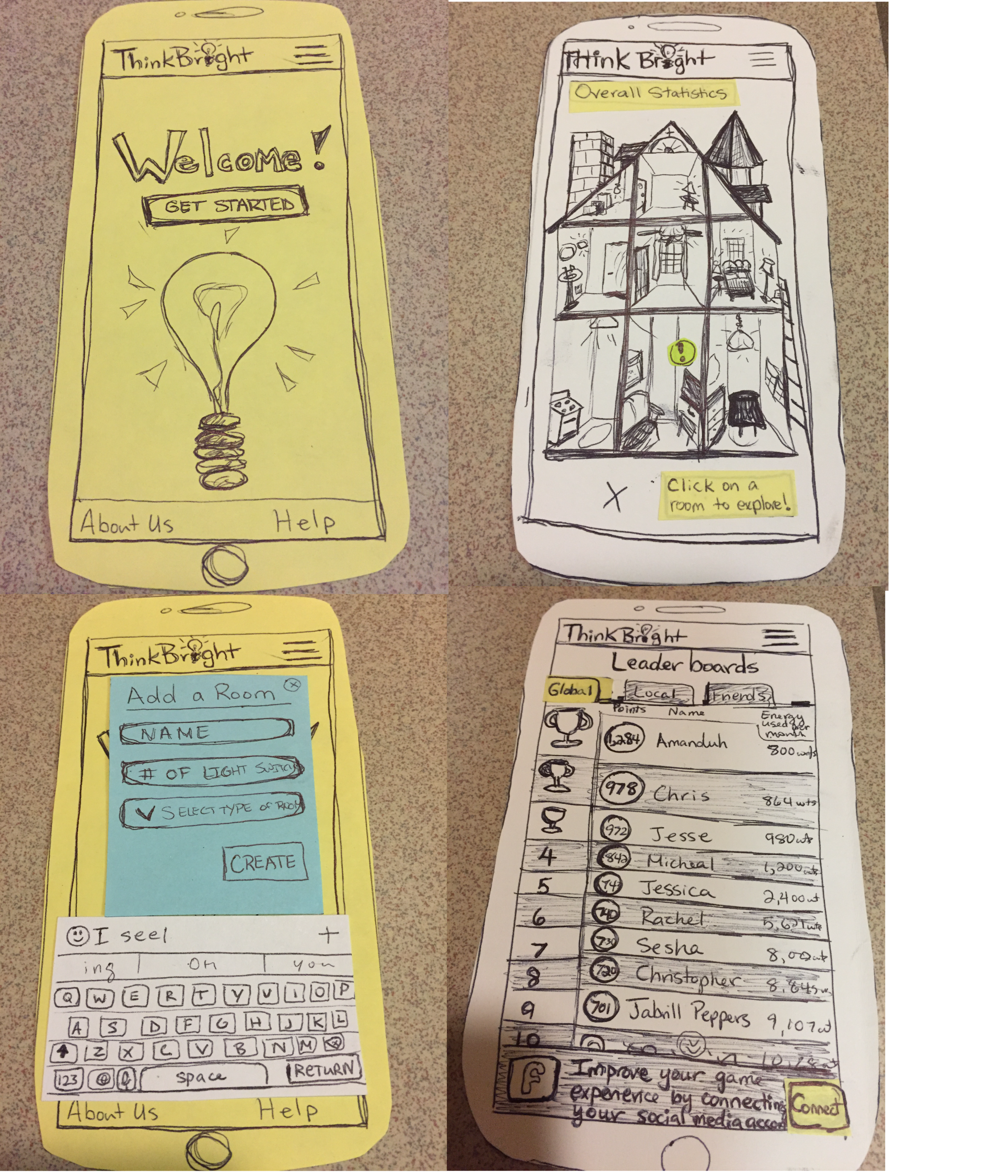
Paper prototype for inital user testing.
Homepage Display iteration:
For our first design issue, representing the data of a houseful of energy uses in a non overwhelming way, our ThinkBright team utilized metaphors with visual imagery to illustrate the energy uses through a virtual house display on the app. A user is able to browse through each room with an avatar, or look at a less detailed list view version of the home overall. Initially, our team planned with our brainstorming sketches and concept mapping for a 3D house model which a user could explore with an avatar.
After further discussion with potential users in the paper prototyping phase, we changed our focus to make the default a list display of rooms, with the option to change to a 3D model for more visual users. We found that some potential users liked the idea of scrolling through a list view for simplicities sake, stating that if the set-up sonar signal didn’t represent their home correctly then the 3D model may bother them.
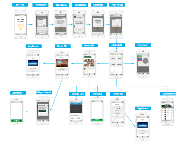
An interaction map of the connections between screens.
Potential Impact:
ThinkBright as a mobile application could have a significant societal impact around the context of environmentalism and consumer awareness. While some users may download ThinkBright for the money saving purpose of lowering their energy bill, they are at the same time lowering their home’s personal carbon footprint. If we can engage users with the leaderboard, “Did You Know” pop ups, and other social gamification elements of ThinkBright we could increase consumer awareness of environmentally friendly habits which make the fight against global climate change seem doable on a day to day basis. This day to day step taking is something humans inherently struggle with. We know in an abstract way recycling and using less electricity is positive for the environment, but by having an application like ThinkBright telling them exactly how much they have saved, and how it has decreased their environmental impact, they will be increasingly more motivated to continue their efforts towards a habitual eco-friendly lifestyle.