Project overview:
Confused.com is a price comparison website located in Cardiff, Wales UK owned by Admiral Insurance Group PLC. It was the first insurance price comparison website in the UK, beginning very strongly, but now follow two newer price comparison websites who popped up with friendly user interfaces and fun advertising. During a 12 week internship, research was conducted on the homepage, car landing page, car insurance quote journey of Confused.com. Based on in-depth user testing and Google Analytic data, I created wireframes to solve user pain points through the car insurance quote process. AB and multivariant tests were then designed to test for increased conversion rates.
Competitive benchmarking:
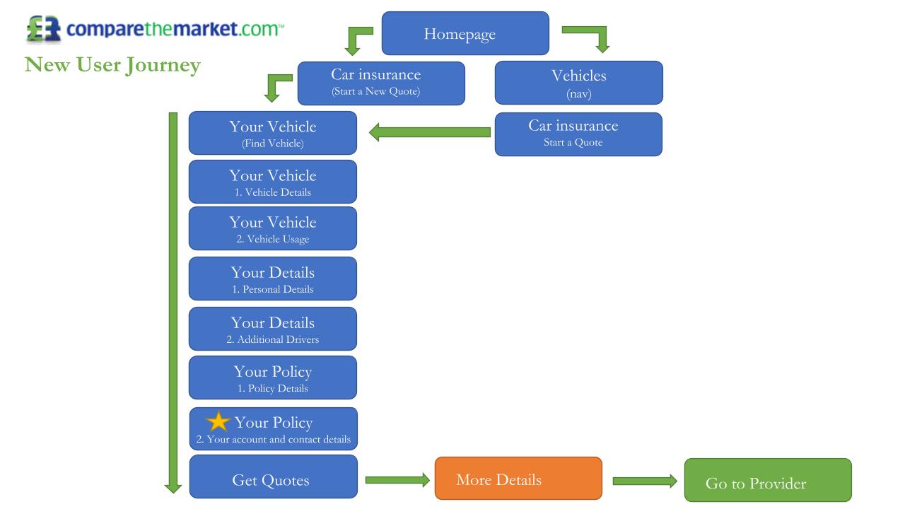
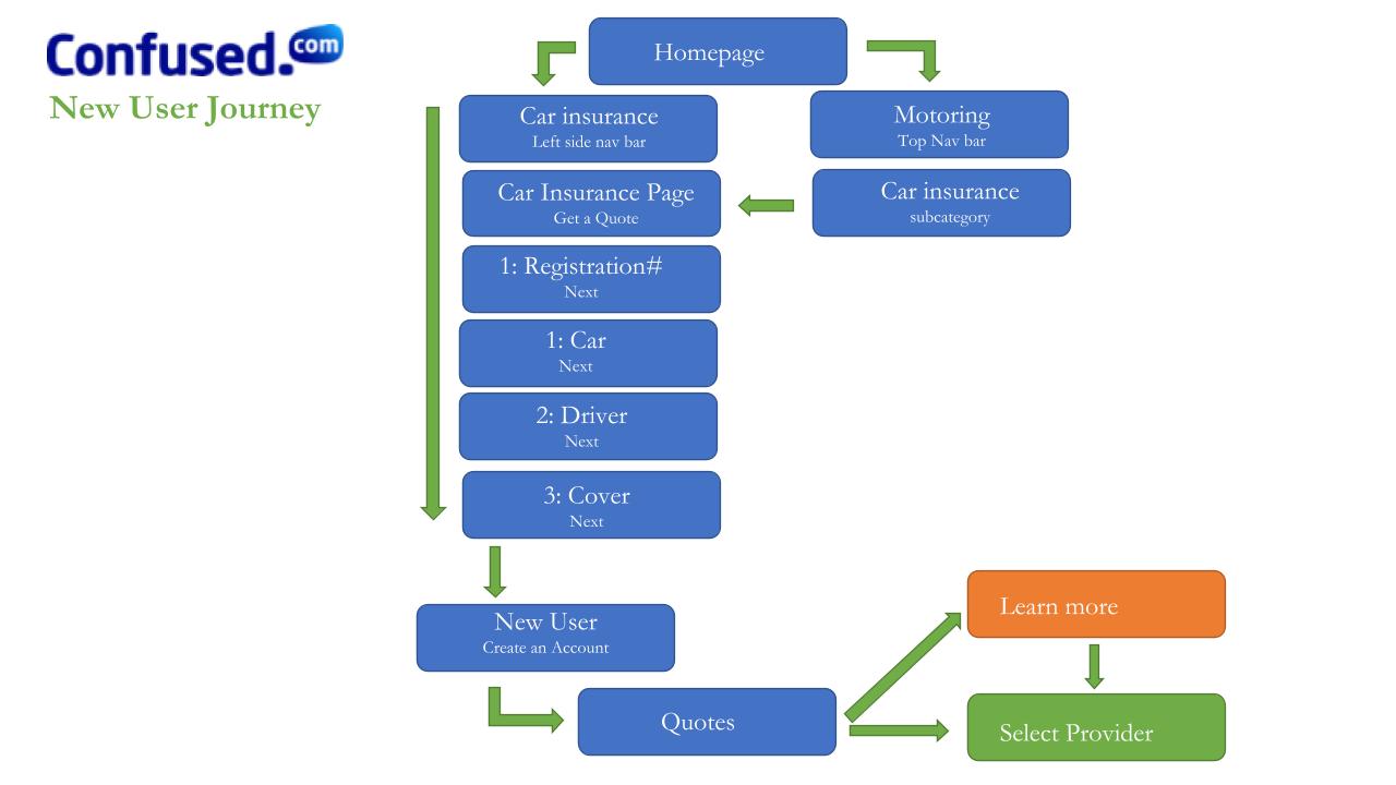
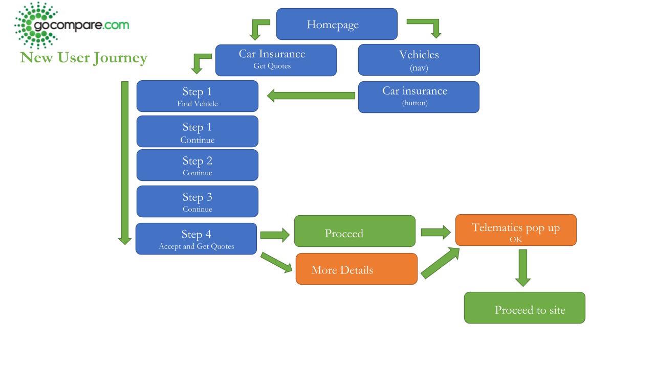
In depth Google Analytic and competitive research was first conducted on the homepage, car landing page, and car insurance quote journey of Confused.com and it's main competitor sites: GoCompare, MoneySupermarket, and ComparetheMarket. In order to visualize the quote journey process differences, user flow journeys were created.
Redesign:
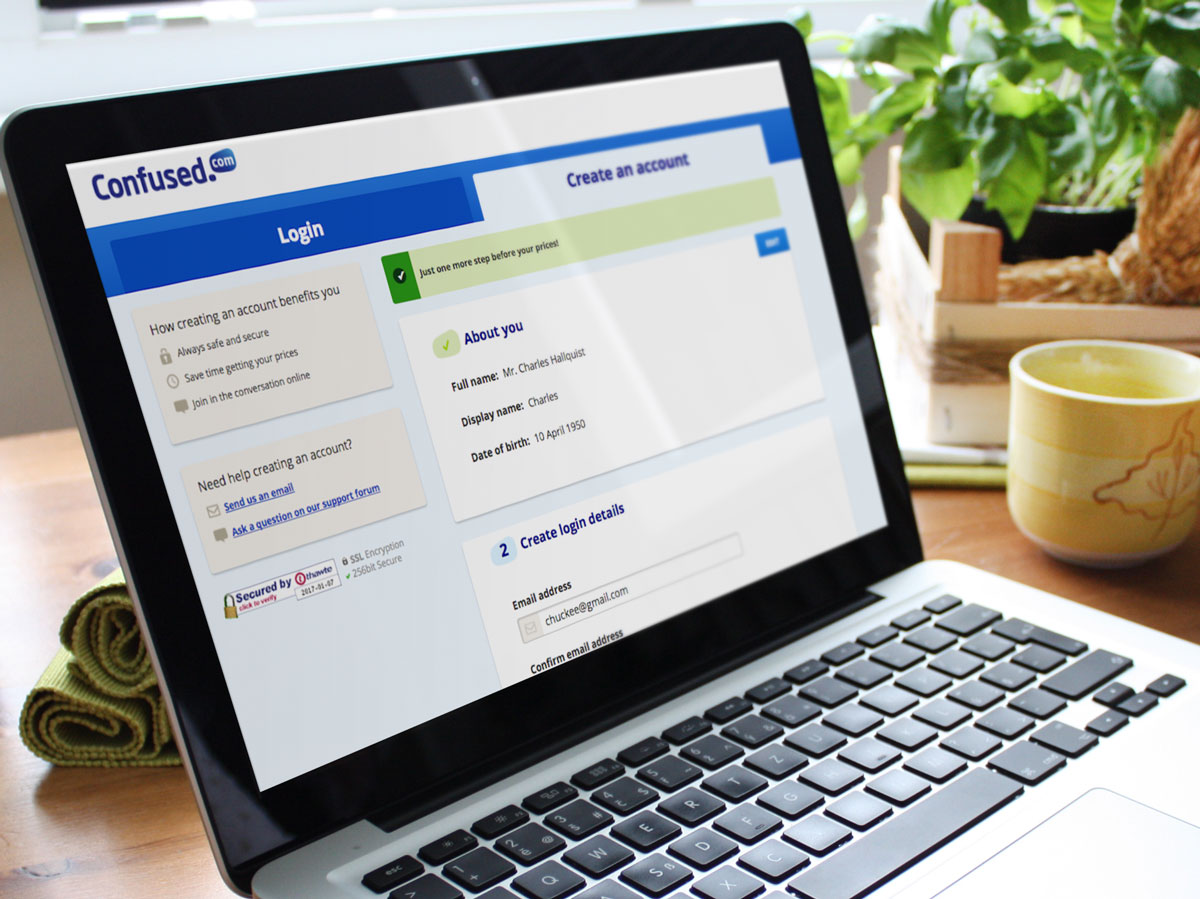
As the user testing clearly demonstrated, users were overwhelmingly frustrated on the login page due to inadequate signaling that the login process was mandatory and part of the car insurance quote journey. The jarring layout design change created the effect of arriving to the page accidently.
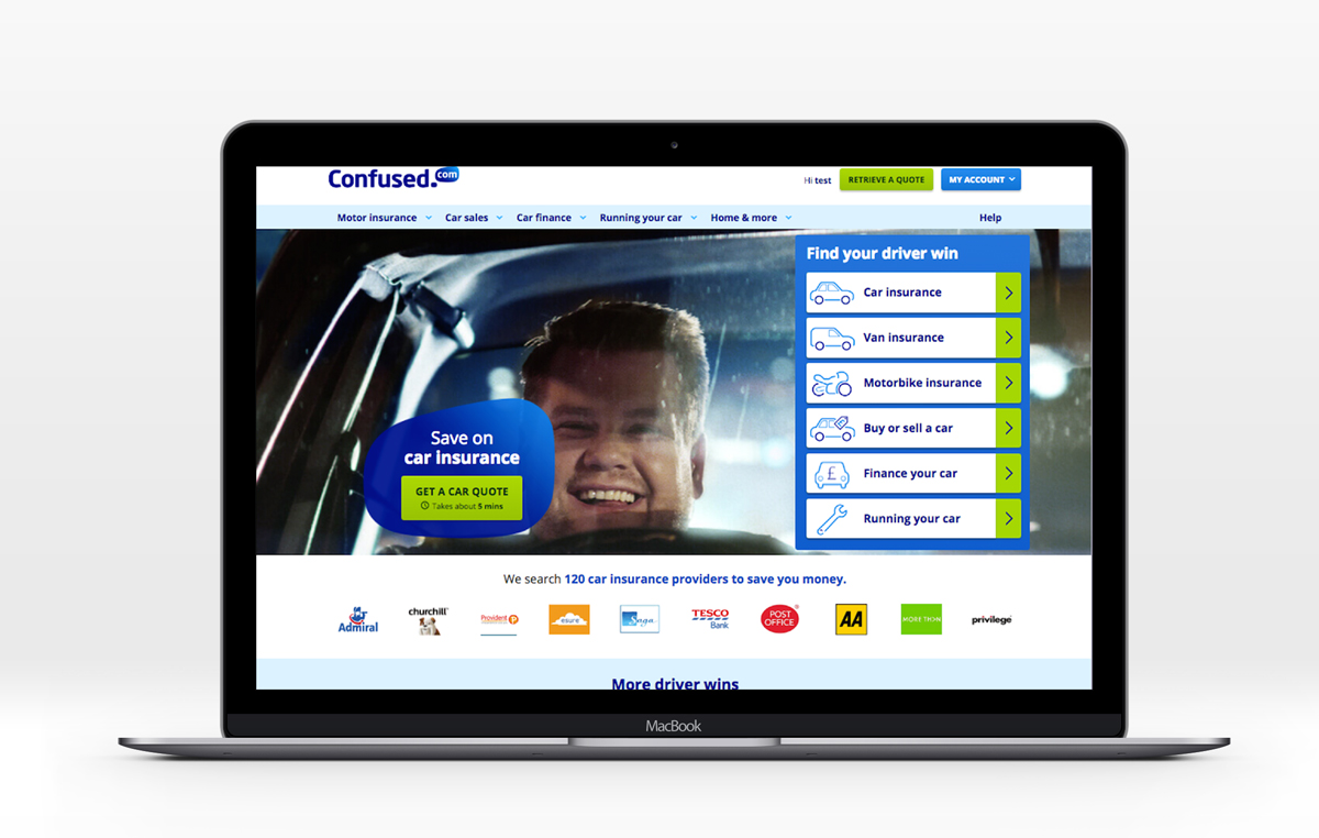
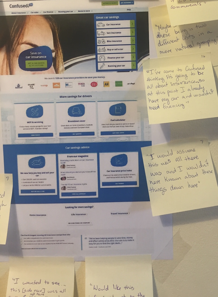
Many participants also noted the lack of signals to promote trust on the landing pages. Since car insurance comparison is quite a competitive market in the U.K., participants wondered why they should be using Confused.com over a competitor site. The few who scrolled to the bottom of the landing pages noted they wished the information that Confused.com was the first car insurance comparison site was in the first screen impression.
User testing:
To gain deeper insight into user pain points throughout the car insurance quote process on Confused.com, I planned and facilitated in-person user tests on sample Confused.com users. Camtasia recording software was utilized for screen recording as users walked through a series of tasks on both the Confused.com site and a competitor site. Afterwards, participatns were asked about perceptions of Confused.com branding and visual design of the site based on participants experience on the website.
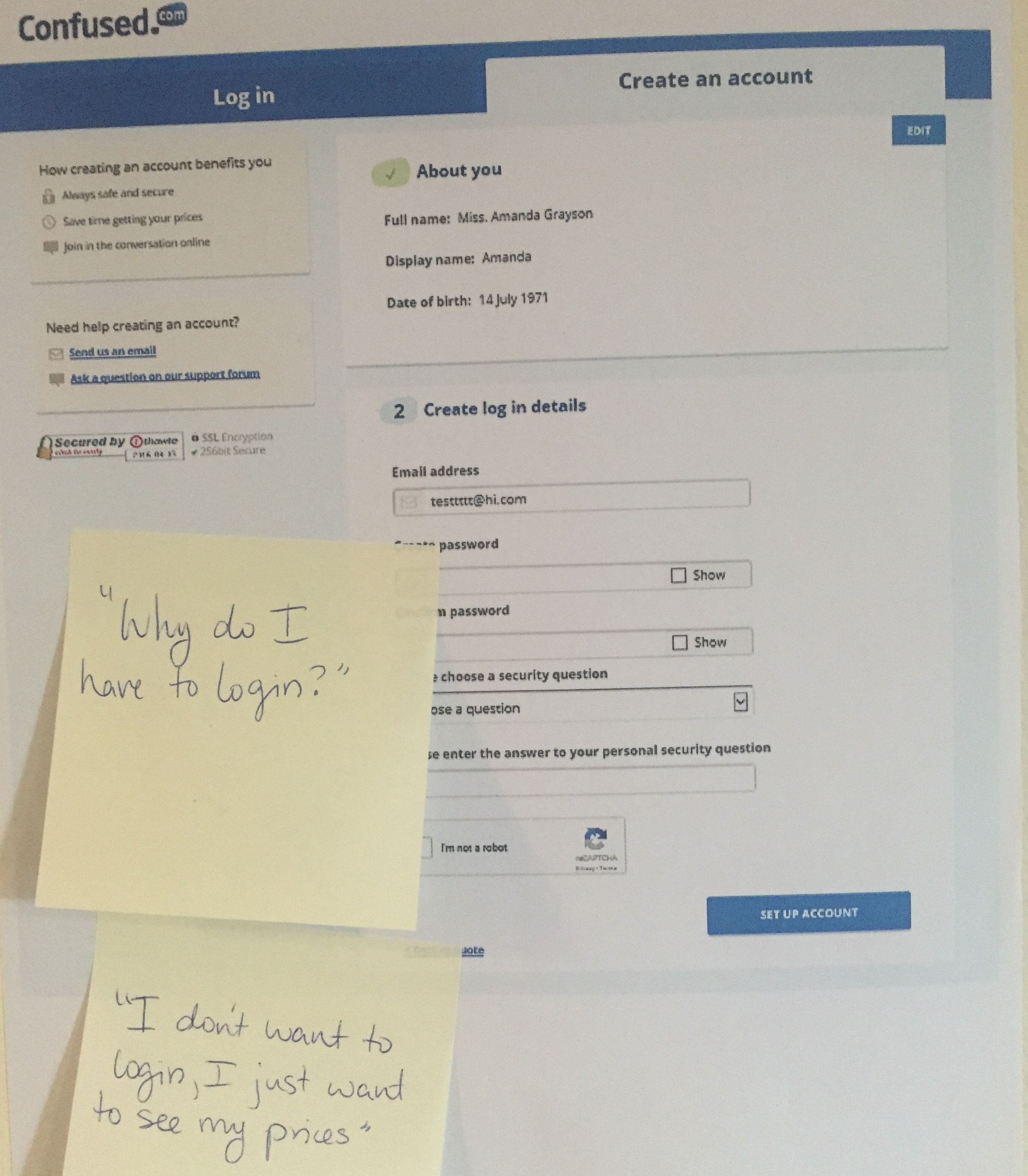
The main user pain point uncovered in the user testing was a misunderstanding of the create an account point in the car insurance quote journey.
Wireframe mockups:
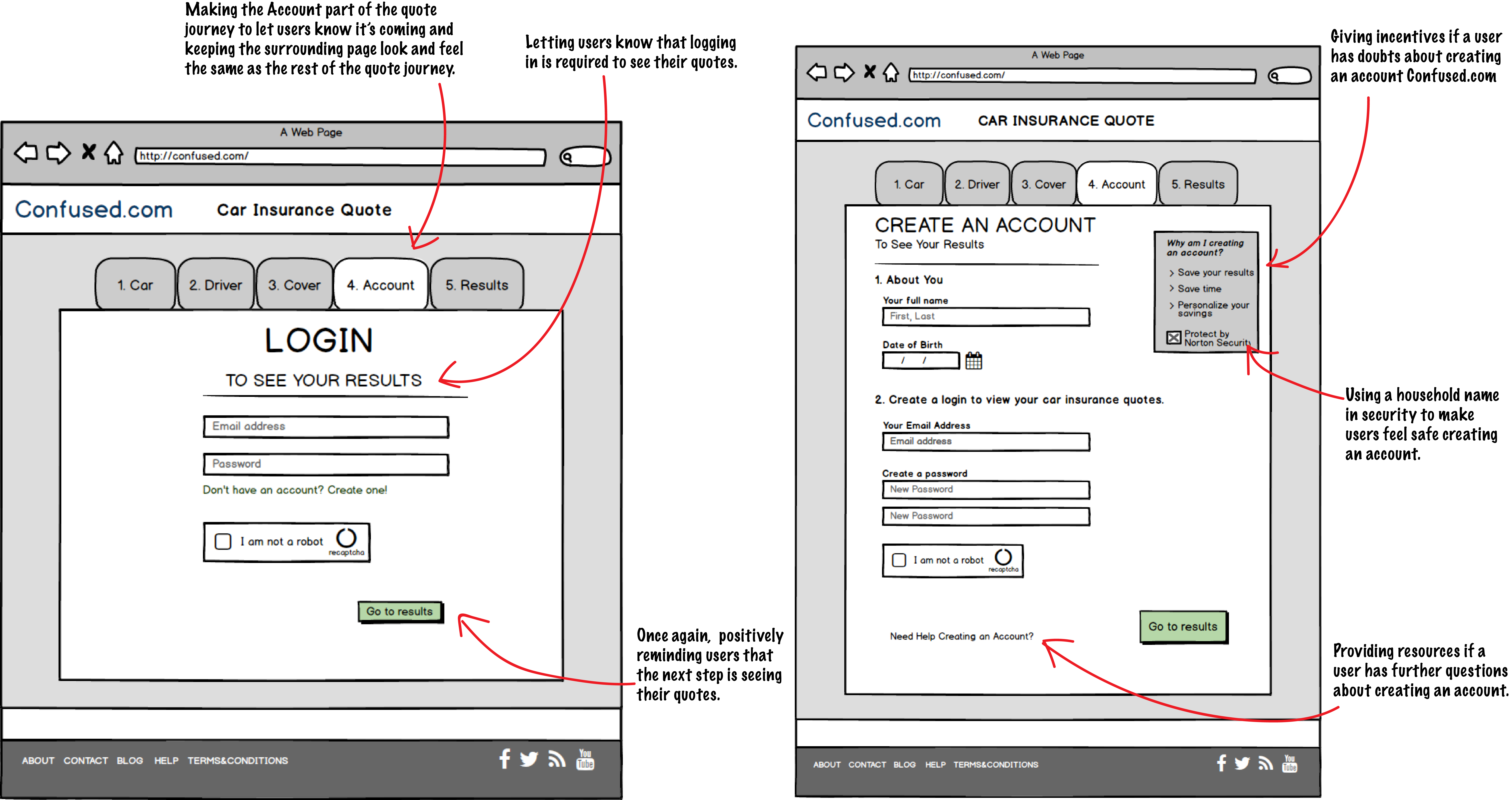
Based on the 20 user tests, wireframes were created to show several ways of designing the login page that would (A) communicate that the login process was mandatory and (B) prevent the jarring feeling of arriving to the page accidently by making it appear to be under the same 1, 2, 3, 4 steps of the rest of the car insurance quote journey. Secondly, mockups were created of the homepage to further legitamize Confused.com in the eyes of it's users.
Results:
Multiple AB tests were created through SiteSpect around the wireframe mockups. Simple wording changes on the top of the login page to indicate the login process was required to see their quotes resulted in an 8% increase in conversion rate of users clicking through to the quote results page. The overall findings for improving the user experience throughout the car insurance quote process were presented to the CEO and product managers at Confused.com during a 2 hour meeting.